The challenge
Yana Petysh, marketing director, Europrom: “We identified three distinct requirements for the packaging we were looking for:
- The IML labels needed to stand up to the pasteurization process.
- The top film for the packaging needed to be easy to peel open, while still ensuring long product shelf life.
- The labelling needed to allow attractive, eye-catching decoration.”
Designed to stand the heat
"The high temperatures of the pasteurization process demanded heat-stable IML labels. As the containers for Cream Fish were made from polypropylene, MCC Global IML responded with an IML label specially designed to withstand the rigors of pasteurization. Plus, knowing that the packaging and the IML labels are made from the same material, this also means that the packaging is 100% recyclable", explains Julia Krasnikova, Sourcing & Procurement Director at Mir Upakovki.
Easy opening
However, there were issues in finding an optimal combination of packaging and sealing film. This was resolved by working with different suppliers for different parts of the packaging. MCC Global IML and all the other suppliers communicated clearly to ensure excellent understanding of the requirements and a smooth collaboration. This resulted in perfect IML packaging.
![Europrom food products with pasteurization]()
The right look
This perfection even extended to the look. One of the criteria in finding different suppliers was that the different parts of the packaging would have exactly the same colors to ensure an attractive, uniform look.
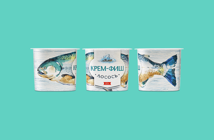
Mikhail Britcyn, Regional Sales Manager for Russia & CIS and Technical Support Engineer at MCC Global IML adds: “Of course, in-mould labeling allowed for high-resolution images to be printed on all sides of the packaging, with one single label. As this artwork needed to stand up to the high-temperatures of the pasteurization process too, we proposed the use of special heat-stable dyes and lacquers that would avoid instability, color fluctuations or bleeding out.”
The added value
“The high-quality printing and original packaging also opened another door. Europrom thought about how it would be able to encourage consumers to purchase more than one portion of Cream Fish at a time by creating three different but complementary designs on the packaging. By placing two or more different packages alongside each other, consumers would be able to create their own story and image of a fish or squid. Fish shelves are usually quite conservative. It is unexpected to see light water colors and gamification in this sphere. This attracts definitely the attention of the potential consumer. It also gives the possibility to the store to create a new unexpected exposition of the product.” says Yana Petysh, marketing director at Europrom.
Success!
New to the Russian market, this approach proved immediately successful. Europrom experienced a sharp increase in sales volume after they released Cream Fish. A year later, the product continues to be extremely popular, a leader in its market segment.


