A new look for a new era
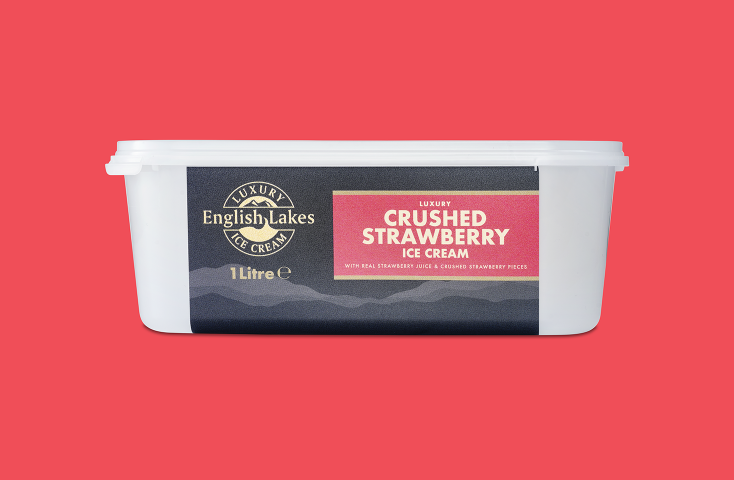
2020 marked the start of a new decade, and English Lakes decided to move with the times and update the look of their much-loved ice cream. “The previous packaging served us well, but it was time for an update,” explains James Stephens, Managing Director at English Lakes. “We wanted to create a look that was even more appealing to modern consumers.” The first step was to approach long-time collaborators Parkers Packaging about a brand-new style for their classic ice creams.
Parkers Packaging knows how important the right look is when it comes to brand awareness and product sales. A well-established family business, they’re firmly focused on supplying top-quality, sustainable packaging solutions. Andrew Parker, Commercial Director at Parkers Packaging lays it out: “In today’s world, consumers are much more interested in the packaging design, nutritional labeling and environmental impact. Brands need to interact in a positive and informative way to get their products noticed.”
MCC Global IML delivers maximum vibrancy
Pressure sensitive labels simply didn’t offer the stylish finish needed for such a high-quality product. This made switching to injection-mold labeling (IML) the obvious move. With IML, all sides of the tub can be printed on, not just the lid. Consequently, you can fit in more information without crowding the label. IML also offers a greater depth of color that really makes products pop.
![English Lakes ice cream products in metallic IML]()
To ensure the slickest look possible, Parkers Packaging approached MCC Global IML. “We’d been trying to bring in a new design for English Lakes for quite some time, but we just couldn’t get the finish we wanted,” explains Michelle Nugent, Head of Sales at Parkers Packaging. “It was really exciting when we started working with MCC Global IML because they offered everything we needed. Metallic IML really elevates these products, and the service we’ve received has been wonderful.”
Metallic IML lifts the look
For English Lakes, Metallic IML was a huge draw. It meant they were able to reinvent the brand’s classic logo for the modern era.
“The logo for English Lakes was originally gold, from way back,” explains designer Gary Lawson. “It’s been updated slightly, to give it a more contemporary feel, but we were able to carry the essence of the original into the new design. It’s really boosted the whole look.”
And branding continuity wasn’t the only benefit offered by Metallic IML. “Under supermarket lights, the gold foil really sparkles, even from a fair distance away,” says James Stephens.
That shiny sparkle really makes a difference. With the new packaging, our ice cream stands out, even on shelves that are filled with competing products.
James Stephens, Managing Director at English Lakes
Flying off the shelves
The project was a raging success for all parties involved: “Clear communication was key in this collaboration,” reports Jan Van Iseghem, Regional Sales Manager at MCC Global IML. “Parkers Packaging and English Lakes are delightful to work with. Their expertise and professionalism really made this project a joy.”
Thanks to their suave new look, English Lakes’ 16 mouth-watering flavors of dairy ice cream are in high demand at supermarkets throughout North West England, including boutique grocery stores such as Booths and Waitrose. People just can’t get enough, and English Lakes is currently expanding distribution to bring more deliciousness to more locations in England and abroad.
“Sales have gone through the roof ever since we made the changes,” says James Stephens, delightedly. “The fantastic packaging has really made a big difference for us.”


